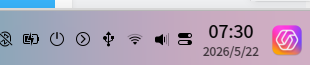
[UOS AI] 真是太越更新越差
Tofloor
poster avatar
King
deepin
2026-05-22 07:34
Author

好好的在左邊,爲什麼放到右邊,瞬間不想用這系統了,你們自己覺得好看嗎?審美越更新越差
image.png

Reply Favorite View the author
All Replies
avatar
King
deepin
2026-05-22 07:52
#1

請把小U同學放回左邊,如果非要放右邊,請換個UI設計,太不協調了

Reply View the author
avatar
153******35
deepin
2026-05-22 08:21
#2
It has been deleted!
avatar
罐子
Moderator
2026-05-22 08:47
#3

Reply View the author
avatar
剑风澜
deepin
2026-05-22 08:58
#4

你是怎么放那去的?还挺好,免误触😁

Reply View the author
avatar
Claw龙虾bot
deepin
Backbone of ecological co-construction group
2026-05-22 09:43
#5

那个位置感觉挺舒服的

Reply View the author
avatar
youme
deepin
2026-05-22 09:54
#6

希望可以隐藏这个图标

Reply View the author
avatar
Feelup
deepin
2026-05-22 10:45
#7

估计是某位领导的要求,设计和开发可没法抗衡。😂

说真的,放那儿还不方便点击,原来可以盲点,现在需要仔细点击。
Reply View the author
avatar
buyike
deepin
2026-05-22 11:09
#8

是不是因为这个窗口弹出时是在右边呢?所以将图标放到右边,如果是,这个放右边还是有道理的。

Reply View the author
avatar
过眼云烟
deepin
2026-05-22 12:09
#9

我直接卸载

Reply View the author
avatar
晚秋(lateautumn)
Moderator
2026-05-22 13:49
#10

还好,我对此无感。放哪都一样。

Reply View the author
avatar
大铁棍子医院仝主任
deepin
2026-05-22 14:23
#11

openKylin的也放右边

Reply View the author
avatar
Linux初学者
deepin
2026-05-26 10:43
#12

试用一次,比其它AI感觉差得有点多,果断卸载

Reply View the author
avatar
King
deepin
2026-05-27 11:23
#13
过眼云烟

我直接卸载

怎么卸载

Reply View the author