

 中文
中文 
buyike deepin
2025-07-08 08:56 deepin 第一感觉是行业属性错误,这标志完全是银行和金融的,和IT行业没关系。
第二感觉是太复杂,缩小后辨识度太差,适用性太差,完全没法看,(浏览器标志的主要使用场景很小。)
Reply Like 5 View the author
 deepin
 第一感觉是行业属性错误,这标志完全是银行和金融的,和IT行业没关系。
第二感觉是太复杂,缩小后辨识度太差,适用性太差,完全没法看,(浏览器标志的主要使用场景很小。)

 deepin
 不错,线路图搞成方的,旧更像芯片布线图了,更契合龙芯的本行。

 deepin
 还行吧,本来就不是干IT的,主业是信创,主题还是很合适的。
至于看不清的问题,以后再优化一下也行,再说了,桌面图标看得清不就行了?
 deepin
 旧图标简洁明了,很不错,但清晰度不够,需要设计成超清图标,浏览器左上角不能显示太大就可以了。
deepin 线条太复杂了
logo的大忌。
包括deepin 的logo 也是太复杂了。
 deepin
 还是原来的图标比较好看
 deepin
 挺好的
 deepin
 ICBC?
 deepin
 换图标的意思是以后开始搞钱了
deepin 换图标的意思是以后开始搞钱了
你这角度太独特了吧。
 deepin
 太复杂了
deepin 还是原来的图标比较好看
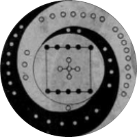
这是原来的。

deepin 这是原来的。
对,就是这个,我还是很喜欢这个图标的,辨识度很高。
deepin 对,就是这个,我还是很喜欢这个图标的,辨识度很高。
能说下你喜欢的原因吗?

 deepin
 一打眼以为XX财经客户端
 deepin
 第一感觉像是哪个银行的图标,当然是银行先入为主了。
单从图标长相说,像是一个铜钱被红绳绑了个十字。如果图标缩小了,看着没有美感,当然了不缩小美感也一般。
deepin 这是原来的。
这个比新的好看些
deepin 太丑了,我都想换浏览器了
deepin 说实话,我用了龙芯浏览器百分之八十是奔着原来的图标去的,芸芸众生一眼就像中了它,简洁明了特别好找,这新图标啥也不是。
 deepin
 感觉跟统信那个logo有异曲同工之妙,都是说的可牛逼可高大上,但是不实用,特别是logo缩小之后,简直没法看
Popular Ranking
ChangePopular Events
More

投票了,投票了,二选一,简单直观。
完成后发给龙芯团队,所以大家注意下语言呀。
优秀的Logo设计需遵循三大核心原则:简洁性、独特性和适用性。