

 中文
中文 
沈拙言 deepin
2023-02-10 20:26 deepin 放在一起好,分两个不好
Reply Like 0 View the author
 deepin
 放在一起好,分两个不好

 deepin
 我在想能不能自定义要不要分开的这种?
或者是分开以后一个可以分别移动(比如说我左边那个放下面,右边那部分放上面去
 deepin
 我在想能不能自定义要不要分开的这种?
或者是分开以后一个可以分别移动(比如说我左边那个放下面,右边那部分放上面去
挺好的想法

 deepin
 就没有都不喜欢的选项?
我选择高效
deepin 就没有都不喜欢的选项?
我选择高效
像win这种布局,简简单单的确实是挺好
 deepin
 就没有都不喜欢的选项?
我选择高效
有,在你自己的控制中心里。

 deepin deepin deepin
不过大样式不应该只是背景的放大
这样会不会更好一些
deepin
不过大样式不应该只是背景的放大
这样会不会更好一些
为啥上传不了图片???

deepin 为啥上传不了图片???

 deepin
 日期可不可以不显示,只要时间就好了,想看日期鼠标挪到时间上再显示
 deepin
 说实话我就看别人怎么选,我的理念能用好看就可以,不过目前23,缺依赖太多,问题多,不适合日用!
 deepin
 我就觉得那根横线实在太碍眼了
deepin 我就觉得那根横线实在太碍眼了
+1
deepin

 deepin
 类似windows的高效模式就好
这种类似mac的布局感觉更适合带鱼屏或者三个以上的屏幕
 deepin
 两个问题:
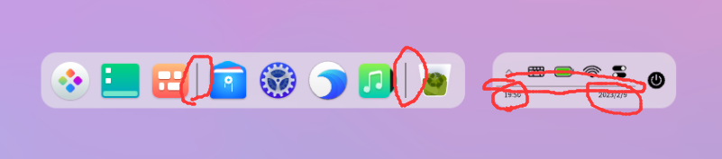
1、分割线太粗了,或者分割线纯黑太深了,特别突兀,V20的早就看得不顺眼了。
2、字体问题,目前的字体看起来特别廉价,特别是状态栏的时间,数字看起来很丑,一点都不精致。
 deepin
 底部栏右端基本是电脑状态兰,电池、输入法、时间、网络情况。
其实使用频率很高,不宜做的太小。
deepin 双行模式那个日期能把眼睛看瞎了。。。
Popular Ranking
ChangePopular Events
More


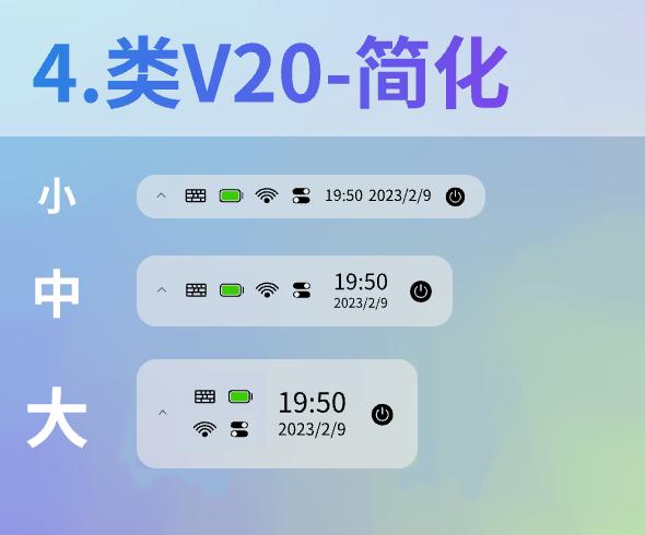
听说有人觉得V23alpha2的任务栏右侧区域不好看?我试着根据现在这个样子稍微调整了一下,你们喜欢哪种呢?
(说实话我不太清楚该怎么称呼这个区域,有没有官方称呼?)
现版本V23alpha2的样子。其实还是挺好看的。就是大任务栏下,关机图标下面会有文字,感觉怪怪的。
与现版本的样子,但是去除了图标的背景框,简洁一些。
缺点:有些情况(例如深色壁纸)下可能看不清图标。
把V20版本的图标和时间布局与现版本的风格结合。
和 3 类似,但是简化了背景框。
缺点:有些情况(例如深色壁纸)下可能看不清图标。
V15时期的任务栏布局和现版本的风格结合。
你们喜欢哪种设计呢,欢迎各位投票。如果还有更好的想法的话也可以提出来。