

 中文
中文 
lindorx deepin
2023-02-10 01:51 deepin deepin缺一个有强迫症的设计师
Reply Like 4 View the author
deepin deepin缺一个有强迫症的设计师

会越来越好的

 deepin
 最小化的时候会好看点,让dock的时间和其他组建图标在一条线上。
 deepin
 珍爱眼睛,远离时尚模式。

 deepin
 deepin缺一个有强迫症的设计师
同感
deepin 实在不能忍受右边的状态栏,尤其是点击日期出来的竟然是通知中心。简直反人类啊。
而且高速模式打开设置中心会有卡顿bug。
 deepin
 吐槽很久了 不行回到deepin 15 吧

 deepin
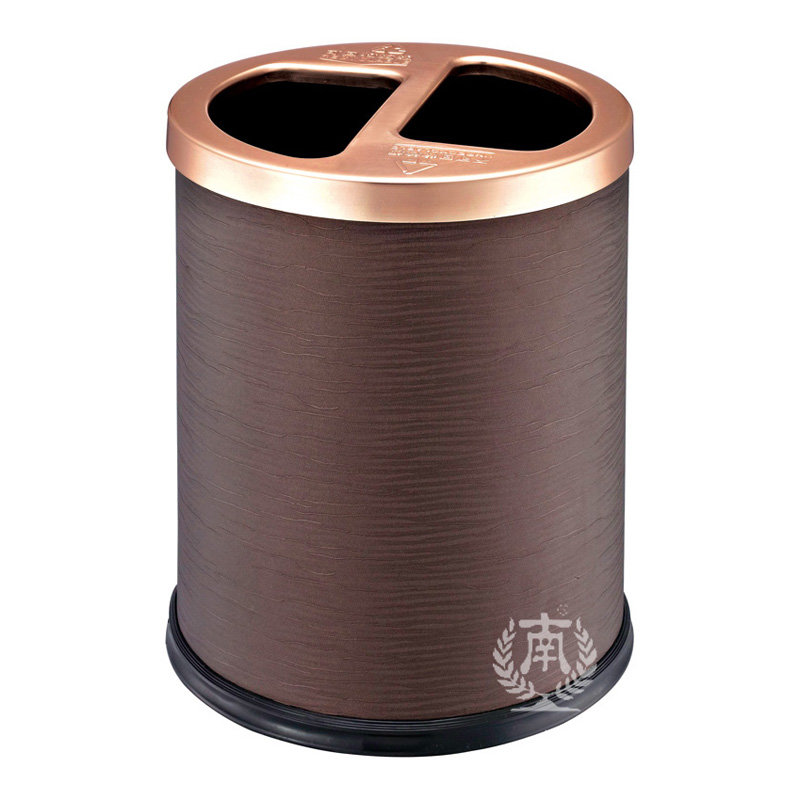
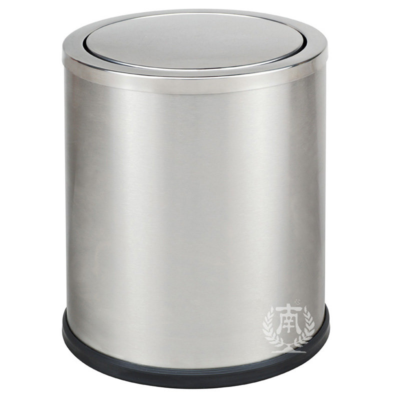
 其实主要就是那个垃圾桶的角太尖了,和dock的圆角过渡不和谐,假如换成下面这种形式的垃圾桶应该会稍微舒服一点吧(图片来源网络):


 deepin
 确实有点紧凑...
 deepin
 越改越折腾,简简单单不好吗,折腾ui还不如把一些缺失的功能解决了,win那种简单高效的ui,简单能干活才是最好的,而不是花哨不能不能干活,那种双行模式,看日期能把眼睛都看瞎了
deepin 同感
一直认为像macos双栏设计才是最好的!
Popular Ranking
ChangePopular Events
More


槽点主要是右边,左边不错,就是我想要的样子。右边不行,全挤在一块了,怎么看怎么别扭。
连win11都知道这样挤在一块很丑,所以也只把程序图标放在中间位置,所以建议bate版的时候改一下,把右边的东西放在右下角或者右上角,任务栏只留任务,看着赏心悦目
而且圆角有点过了,太圆了,圆弧与直边接触的位置没有过渡,很生硬。如果圆角不是图片,是程序画出来的,完全可以改一下算法,让过渡更自然一些。