

 中文
中文 
牦牛儿苗 deepin
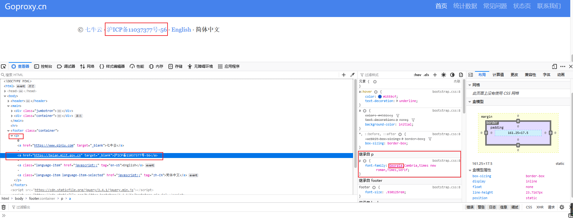
2022-09-20 03:43 deepin 这是网站字体的原因,我在win上看也是这样的
Reply Like 0 View the author
 deepin
 这是网站字体的原因,我在win上看也是这样的

 deepin
 这是网站字体的原因,我在win上看也是这样的
是不是跟编码有关?他好像是UTF-8编码

 deepin
 这是经典的Georgia字体,Georgia采用称为“不齐线数字”的数字,非常适合西文(报纸、书籍)排版的数字阅读,本来设计就是这样的,而且非常著名,而且在计算机(电脑、pc)发明之前,人类能发电之前,就存在了。
 deepin
 是不是跟编码有关?他好像是UTF-8编码
编码问题会导致乱码,会出现很多框框还有菱形问号这样的图形。这样的字大小不一明显是字体的问题。
 deepin
 三楼正解。
 deepin
 我这边不光是浏览网页,有时候用编辑工具也会出现这种问题,好奇怪
deepin 这是经典的Georgia字体,Georgia采用称为“不齐线数字”的数字,非常适合西文(报纸、书籍)排版的数字阅读,本来设计就是这样的,而且非常著名,而且在计算机(电脑、pc)发明之前,人类能发电之前,就存在了。
谢谢解答,😂 但是不觉得很丑吗?现在的用在网站上的字体又不用于书籍印刷,何必这么多人都用这种字体呢😂
deepin 谢谢解答,😂 但是不觉得很丑吗?现在的用在网站上的字体又不用于书籍印刷,何必这么多人都用这种字体呢😂
你的看法没毛病,这个字体用在那里的搭配效果不咋的,作为数字我相信din、lato、SanFrancisco也许是更好的搭配。


这个网站