

 中文
中文 
charm deepin
2022-07-08 05:08 deepin 有区别吗?

Reply Like 0 View the author
 deepin
 deepin
 有区别吗?
deepin 有区别吗?
还是有区别,反正我这个1080p的屏幕肉眼可见的区别,苹方字体有三个特点:
1、字型更加方正,不信你看一行字的底部,苹方对的更加整齐;
2、显示更加锐利,特别是边缘,看不到毛刺;
3、英文显示字间距更加爽目,就那种nice的感觉。
deepin 你在哪里找的字体,我之前下载了几次,在系统设置里都找不到自己安装的字体,最多只能在浏览器里改一下
deepin 你在哪里找的字体,我之前下载了几次,在系统设置里都找不到自己安装的字体,最多只能在浏览器里改一下
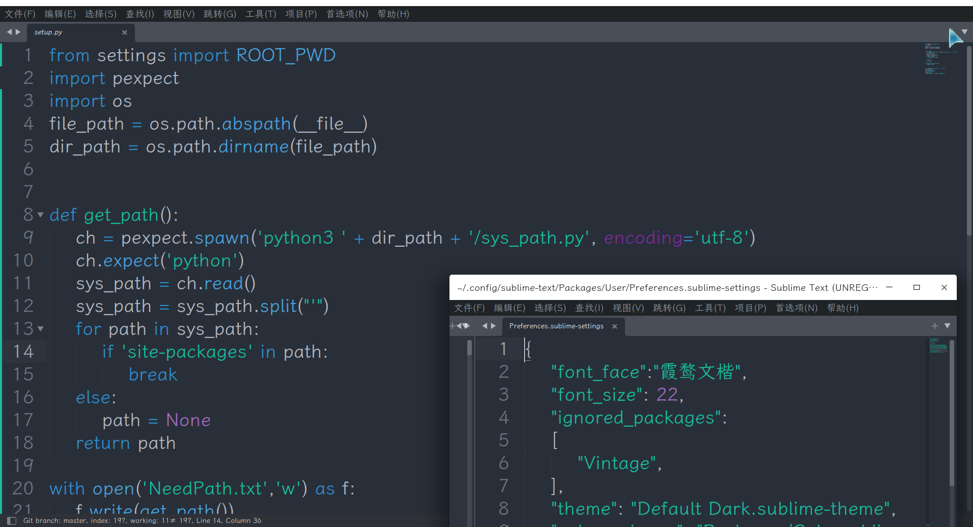
下载的otf文件,双击安装就行了。
如果在设置->个性化->字体中看不到你安装的字体,那就注销或者重启一下再看看。

 deepin
 deepin英文是花体,不知道怎么想的,根本不适合屏幕阅读!
deepin deepin英文是花体,不知道怎么想的,根本不适合屏幕阅读!
deepin默认字体中文显示还行,英文的确差强人意。

 deepin
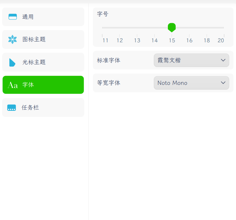
 霞鹜文楷用快腻了,改天试试苹果字体
 deepin
 俺都是noto sans cjk sc, noto serif cjk sc, noto mono一把梭,
4k下大差不差。
deepin 俺都是noto sans cjk sc, noto serif cjk sc, noto mono一把梭,
4k下大差不差。
羡慕你们有4k的,可惜我囊中羞涩,只能几百块的1080p凑合着用用!

 deepin
 我的评价是不如雅黑
deepin 我的评价是将来有一天你工作了,要注意版权(商业授权)。
deepin 我的评价是将来有一天你工作了,要注意版权(商业授权)。
如果不注重版权,说明你就业的公司规模太小,早点换工作。
deepin 我的评价是将来有一天你工作了,要注意版权(商业授权)。
谢谢提醒。不过我是自己电脑上玩玩,可没有商用。
Popular Ranking
ChangePopular Events
More