Home
Categories
WIKI
Topic
User
LANGUAGE:
中文
English
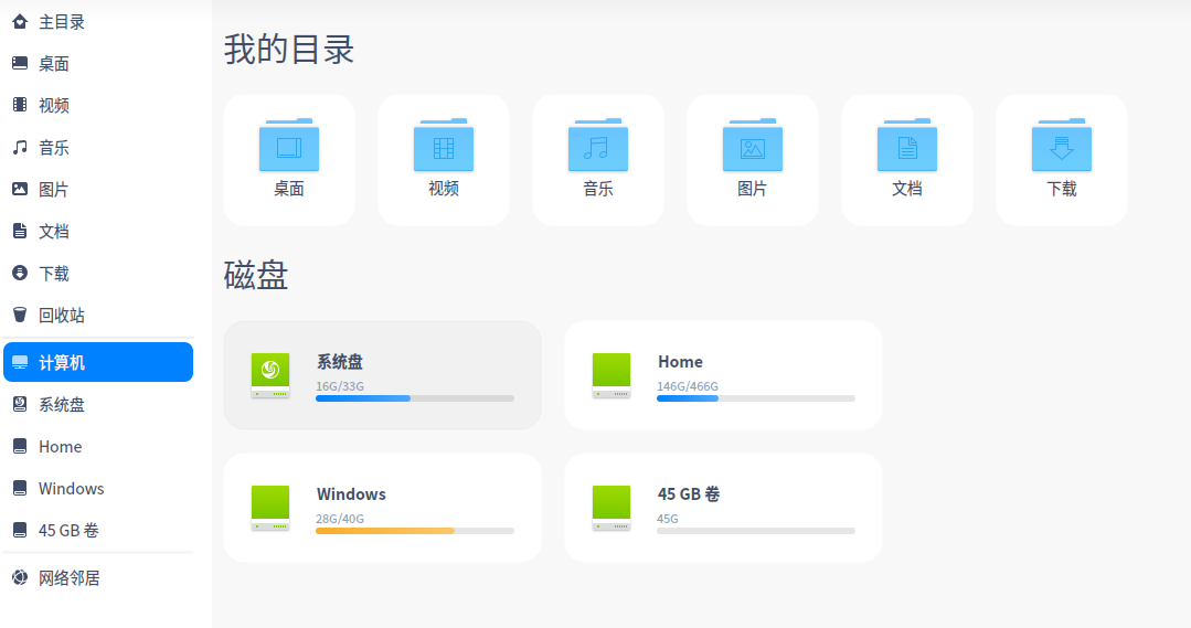
deepin20文件管理器图标太难看了,不如15版本好看。
Experiences and Insight
550
views ·
3
replies ·
To
floor
Go
starpoet
deepin
2020-05-08 19:48
Author
如题,15版本扁平化设计,简洁大气。20版太难看了。建议deepin把15版的图标开发个Windows版本的,我用回Windows算了。
Reply
Like 0
Favorite
View the author
All Replies
终南
deepin
2020-05-08 20:09
#1
在设置里换图标主题不就行了
Reply
Like 0
View the author
yanfung
deepin
2020-05-08 20:37
#2
自己替换了mac的部分图标
Reply
Like 0
View the author
Temp010Temp
deepin
2020-05-08 20:38
#3
我倒觉得比15.11的好看一点,不过总体上也比一般文件管理器图标难看!
Reply
Like 0
View the author
Please
sign
in first
Featured Collection
Change
[Tutorial] deepin25 WSL Offline Installation Guide
UOS AI 2.8 Released! Three New Intelligent Agents & Major Evolution
Solid Q&A | deepin 25 Common Questions – The Immutable System Edition
New Thread
Popular Ranking
Change
WiFi Drivers
Popular Events
More


 中文
中文 
 deepin deepin

 deepin
  deepin
  deepin
 deepin