新图标喷了
Tofloor
poster avatar
drecol
deepin
2017-03-04 03:51
Author
实在搞不懂deepin的美工
Reply Favorite View the author
All Replies
2 / 2
To page
avatar
comzhong
deepin
2017-03-23 20:45
#21
https://bbs.deepin.org/post/135509
这套主题不会再调整了,如果可以,请期待下一套图标主题~

总感觉有点不是很清晰的感觉,像是有一层雾,还有不同图标辨识度有待提高
Reply View the author
avatar
gavin21
deepin
2017-03-23 21:05
#22
就是有点像windows
Reply View the author
avatar
a2035274
deepin
2017-03-23 21:11
#23
https://bbs.deepin.org/post/135509
总感觉有点不是很清晰的感觉,像是有一层雾,还有不同图标辨识度有待提高 ...

同感 刚更新后还以为显卡驱动出了问题
Reply View the author
avatar
He8617439
deepin
2017-03-23 21:29
#24
我觉得现在的还可以啊。
Reply View the author
avatar
左心房的痛
deepin
2017-03-23 23:21
#25
这个启动器的图标,的确让我想起了山寨的android平板
Reply View the author
avatar
蒙笛
deepin
2017-03-24 00:04
#26
本帖最后由 yuzh496 于 2017-3-23 16:44 编辑
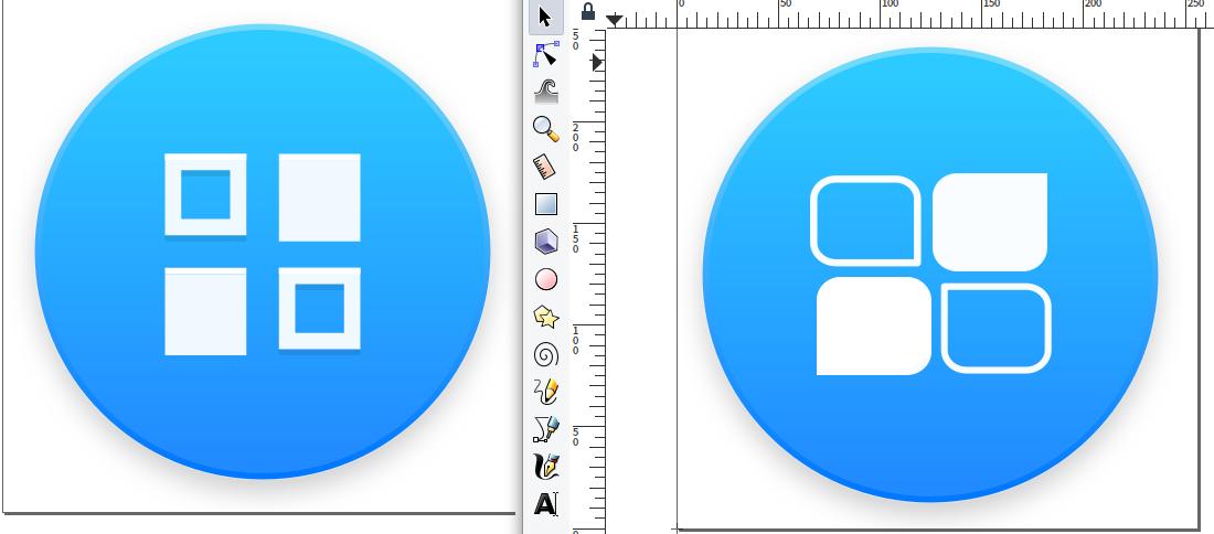
比如像这样子?
只要修改/usr/share/icons/deepin/places/scalable下的deepin-launcher.svg
其他暂时没有发现有什么可以设置图标的地方,那就直接替换了。这样其实就修改了原有的deepin图标主题
其实可以自己做一个图标主题,对照着 /usr/share/icons/flattr 目录做就可以了。在自己的主题里放个deepin-launcher.svg就可以了。

https://bbs.deepin.org/post/132907

如果实在不喜欢,可以换成自己喜欢的。

新标貌似dp字母的意韵合体,又是启动器众多图标的缩略,很形象,挺好的啊。
除了Win一点,没啥。

顺手山寨了一个,左边是原图。
Reply View the author
Comments
licardo
2017-05-27 06:29
随手山寨的都比原来的好看. 原来四个小方块一起挤到中间有美感?
avatar
jingle
deepin
2017-03-24 02:12
#27
https://bbs.deepin.org/post/135509
总感觉有点不是很清晰的感觉,像是有一层雾,还有不同图标辨识度有待提高 ...

这个每个人审美不一样,我们美女设计师 比我们专业点。
Reply View the author
avatar
jingle
deepin
2017-03-24 02:12
#28
https://bbs.deepin.org/post/135509
https://bbs.deepin.org/post/132907

如果实在不喜欢,可以换成自己喜欢的。

厉害。
Reply View the author
avatar
comzhong
deepin
2017-03-24 02:20
#29
https://bbs.deepin.org/post/135509
这个每个人审美不一样,我们美女设计师 比我们专业点。

可能是因为现在文件管理器的图标主要以浅色系为主吧,我觉得 浅色图标配深色背景,深色图标配浅色背景,这样要好点,浅色配浅色就算图标放大了看起来也费眼神
Reply View the author
avatar
Wintersweet
deepin
2017-03-24 02:32
#30
我觉得还不错,比火箭好看
Reply View the author
avatar
akako
deepin
2017-05-26 22:17
#31
https://bbs.deepin.org/post/135509
总感觉有点不是很清晰的感觉,像是有一层雾,还有不同图标辨识度有待提高 ...

你确定你的屏幕擦干净了么~
Reply View the author
avatar
要讲武德
deepin
2017-05-27 00:47
#32
https://bbs.deepin.org/post/135509
我一直在用的启动器图标

怎么改呀
Reply View the author
Comments
MeowSprite
2017-05-27 05:50
看27楼
avatar
sclmusic
deepin
2017-05-27 01:30
#33
图标小意思,可以设置文件夹颜色就行了
Reply View the author
avatar
comzhong
deepin
2017-05-27 01:53
#34
https://bbs.deepin.org/post/135509
你确定你的屏幕擦干净了么~
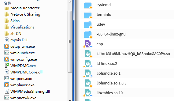
          Windows 的图标基本上大多是深色系,边界也比较清楚,而Deepin 里面的图标没有对边界处理,颜色也是浅色系,所以看起来感觉不清晰。
https://bbs.deepin.org/user/33235   https://bbs.deepin.org/user/48640

题外话:论坛编辑器@老是不正常,图形排版容易错乱,是不是解决一下?像无忧论坛对排版容易错乱就改为默认纯文本方式编辑了。

Reply View the author
avatar
aName
deepin
2017-05-27 06:36
#35
论坛编辑器加上markdown支持,考虑一下?
Reply View the author
avatar
arlen
deepin
2017-05-27 06:54
#36
https://bbs.deepin.org/post/135509
这样的恶趣味我也有

我可能看到了一个假的Deepin。。。。
Reply View the author
2 / 2
To page