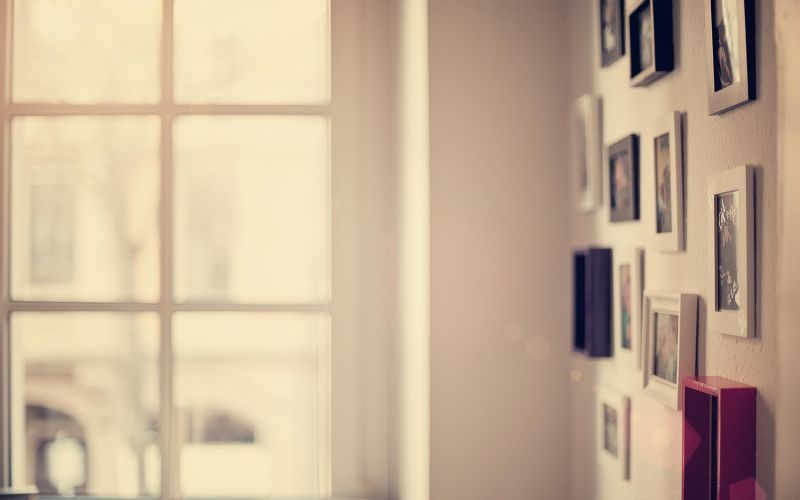
我记得以前有一版很漂亮
Tofloor
poster avatar
Eroix
deepin
2017-02-04 22:18
Author
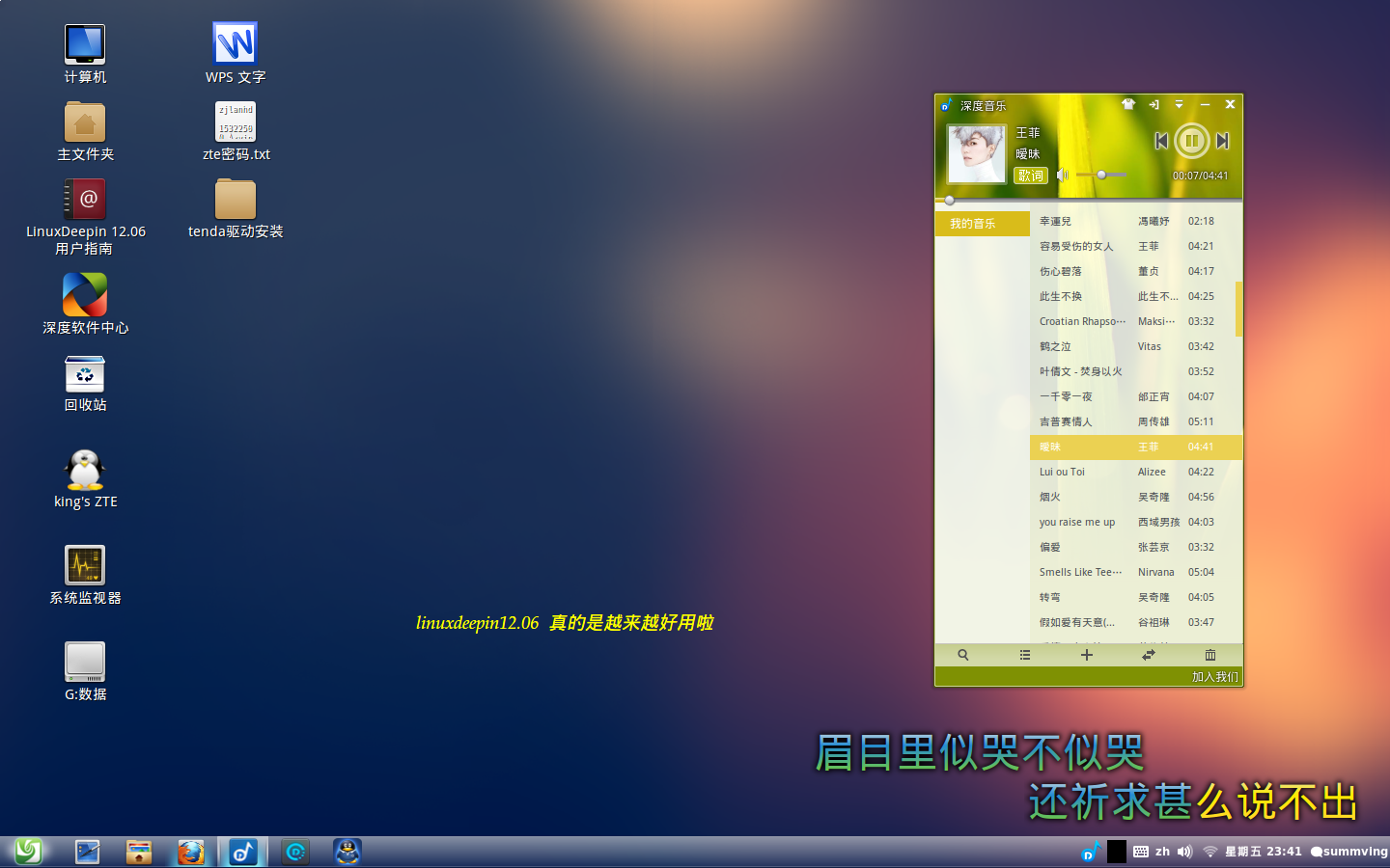
忘了是哪个版本了,当时还被吐槽像win7,“任务栏”放在顶端的。

看了15.4的截图,感觉就是,有点像塑料的质感,没有那个版本那样比较像玻璃。

当然只是吐槽下,个人感觉而已。
Reply Favorite View the author
All Replies
avatar
南浦月
deepin
2017-02-05 00:21
#1
换个显示器就好了~
Reply View the author
Comments
Eroix
2017-02-07 05:07
无关显示器
avatar
j***e@163.com
deepin
2017-02-05 19:43
#2
本帖最后由 tobecxbii 于 2017-2-5 11:57 编辑

deepin 2013版很清新,还记得这张壁纸?

Reply View the author
Comments
Eroix
2017-02-07 05:02
应该就是2013版,那时候的哪方面都很精细
avatar
Summving
deepin
2017-02-05 21:49
#3

Reply View the author
Comments
Eroix
2017-02-07 05:01
就是这个
avatar
20072312834
deepin
2017-02-05 22:17
#4
不只是你自己的感觉,也是我的。我的描述是不够精细了。
Reply View the author
Comments
Eroix
2017-02-07 05:10
就是有那么一种感觉
avatar
晋学解
deepin
2017-02-06 01:16
#5
this?
Reply View the author
Comments
Eroix
2017-02-07 05:01
对的,就是这个
avatar
n1008611
deepin
2017-02-06 01:58
#6
kde界面通常都会被说是“像Windows一样”的
Reply View the author
avatar
20072312834
deepin
2017-02-07 15:57
#7
https://bbs.deepin.org/post/134648
kde界面通常都会被说是“像Windows一样”的
不是说像谁,而是对色彩的一种处理,我曾经注意到mac的色彩和windows就不一样,同样图片,mac里面看起来色彩就特别浓。而deepin里面则比windows还要淡。整体感觉有层磨砂的模糊感。这个东西我们讨论不出什么结果来,应该呼叫王勇大神给个解释。
Reply View the author
avatar
188******76
deepin
2017-02-07 18:02
#8
不要猜了,是12.06版本
Reply View the author